This is awesome! The new naval museum in San Diego aboard the USS Midway.

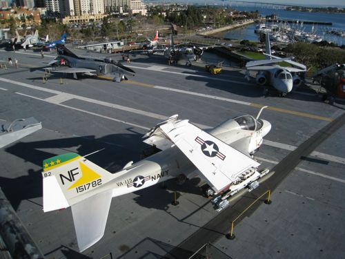
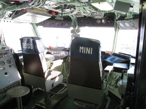

This is awesome! The new naval museum in San Diego aboard the USS Midway.


As I now have a USB cable I’ve been able to upload some photos.
San Diego is a cool town. Among the sites were the Pandas at San Diego zoo:

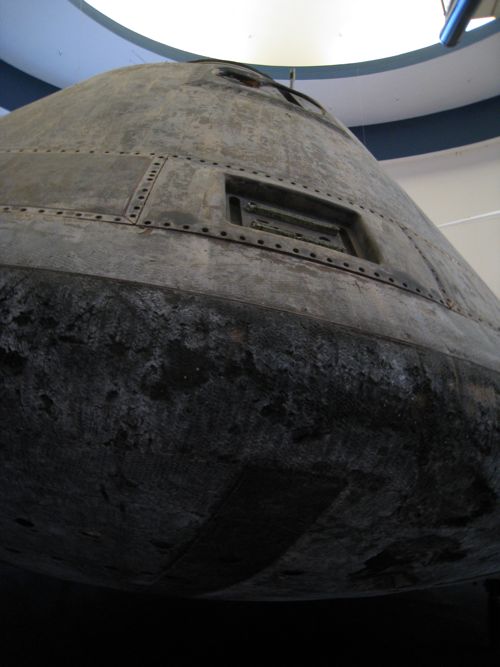
Then off to the Air and Space Centre. You’re greeted by the Apollo 9 capsule:
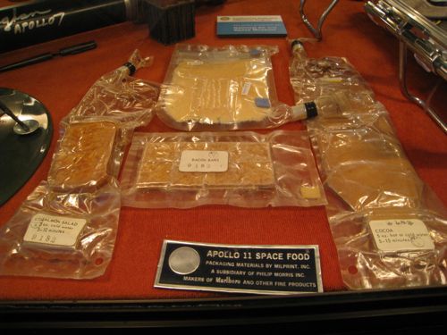
Apollo 11 unused food:
Phantom vs MiG:

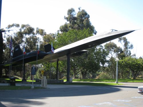
SR71 Blackbird:
Giant magaritas in oldtown:

Just back at Mix from the indoor rifle range just out of town. Still have grease from the AK I fired. Tash had a go on an Uzi 9mm. Kinda fun but kinda scary at the same time, and some of the people at the range (although not the instructors) were pretty freaky.
Firing these things was f-ing scary, as you can probably see from the look on my face!

I’ve been using Picasa of late, you get a gig for free. Sweeeeeeeet.
It looked great when I took it, somehow I just couldn’t capture the ambiance…
Sweeeeeeet! The proposed addition to Wellington’s International Airport. There’s the usual round of “it’s ugly” from people who feel safer with mediocre architecture. I’ll admit it’s on the quirky side and not really worthy of the ‘iconic’ label (which conjures up the Sydney Opera House, Bilbao’s Guggenheim, etc), and “The Rock” is a camp name, but I love that the Airport’s Management are open to building an interesting structure instead of sticking to the norms. The main terminal is one of my favourite buildings in Wellington, and I’m glad that it is about to be joined by what could be another.
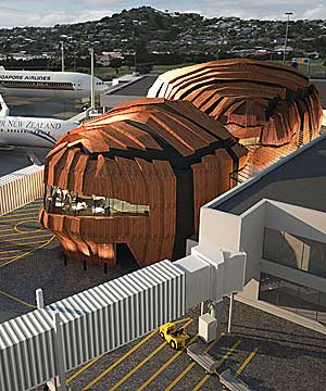 (image stolen from Stuff.)
Although Stuff doesn’t say who the architects are, a Google reveals that it is probably Studio Pacific Architects (although as of writing this there is no word on their website, which is weird). But good work all around for this.
This really is one of those classic ‘caption contest’ photos:

(Image courtesy of the fabulous redesign of the ‘The Independent’ newspaper’s website.)