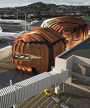
Sweeeeeeet! The proposed addition to Wellington’s International Airport. There’s the usual round of “it’s ugly” from people who feel safer with mediocre architecture. I’ll admit it’s on the quirky side and not really worthy of the ‘iconic’ label (which conjures up the Sydney Opera House, Bilbao’s Guggenheim, etc), and “The Rock” is a camp name, but I love that the Airport’s Management are open to building an interesting structure instead of sticking to the norms. The main terminal is one of my favourite buildings in Wellington, and I’m glad that it is about to be joined by what could be another.
 (image stolen from Stuff.)
Although Stuff doesn’t say who the architects are, a Google reveals that it is probably Studio Pacific Architects (although as of writing this there is no word on their website, which is weird). But good work all around for this.
3 responses to “Great addition to Welington Airport”
Rocks? They look more Halloween pumpkins! They’d make a good talking point though 🙂
It was Studio Pacific in association with Warren and Mahoney. Bravo to both wellington airport and the architects for daring to be different!
Big ups to Studio Pacific and Warren and Mahoney. Studio Pacific have done some great work around Wellington, including the current terminal and the beautiful Meridian Building. I have high hopes for The Rock!